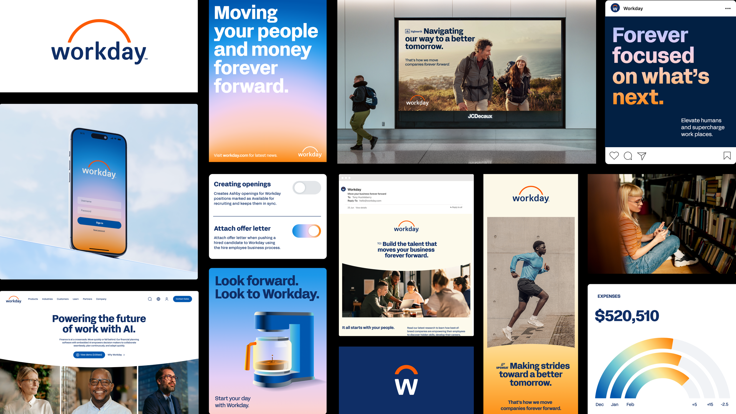
workday
rebrand
Reimagining a global brand and building the systems to scale it.
ROLE
Lead Designer —
Iconography & Photography
YEAR
2024–2025
DISCIPLINE
Brand Identity, Design Systems
PARTNERS
Koto + Workday Brand Team
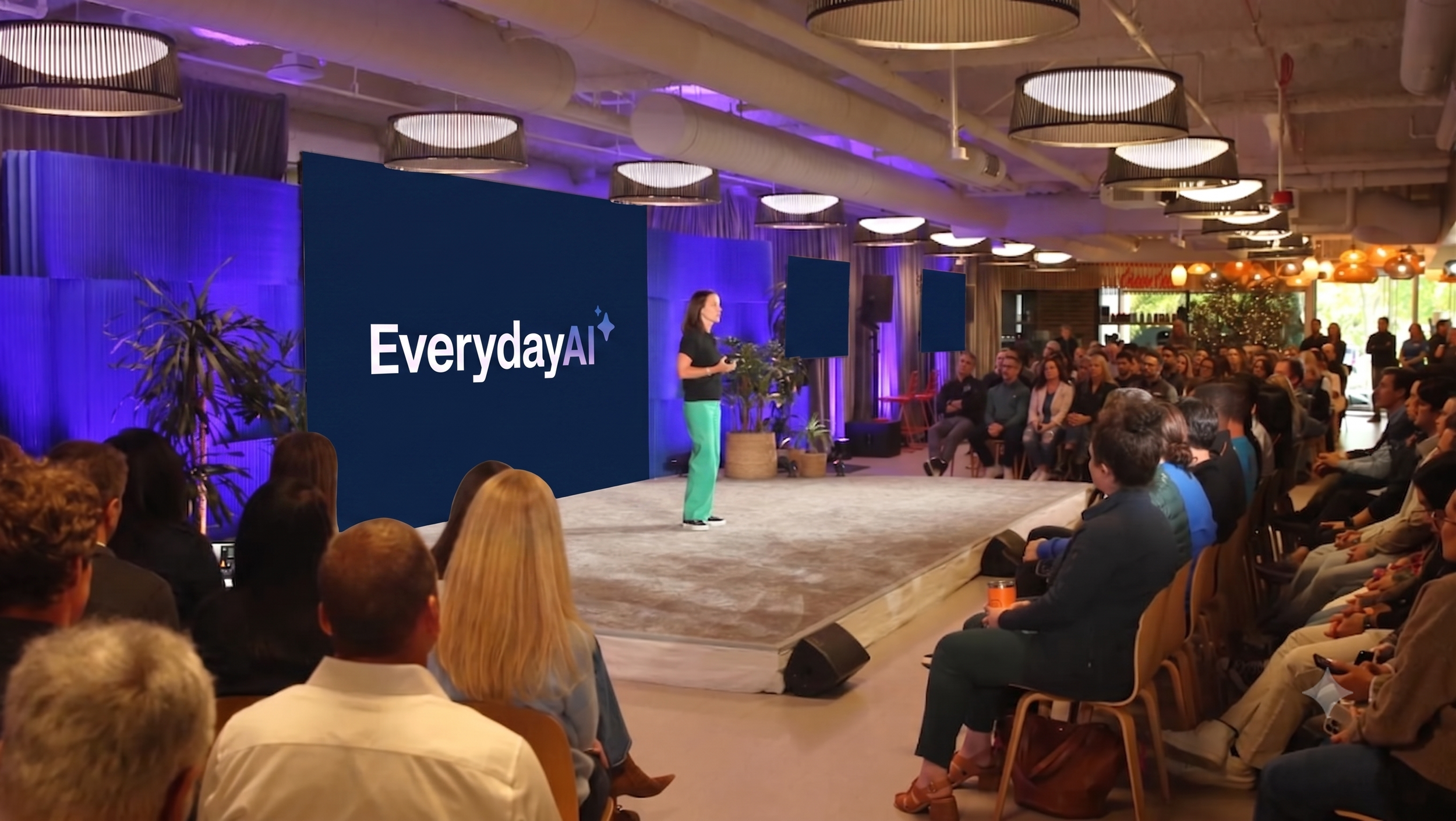
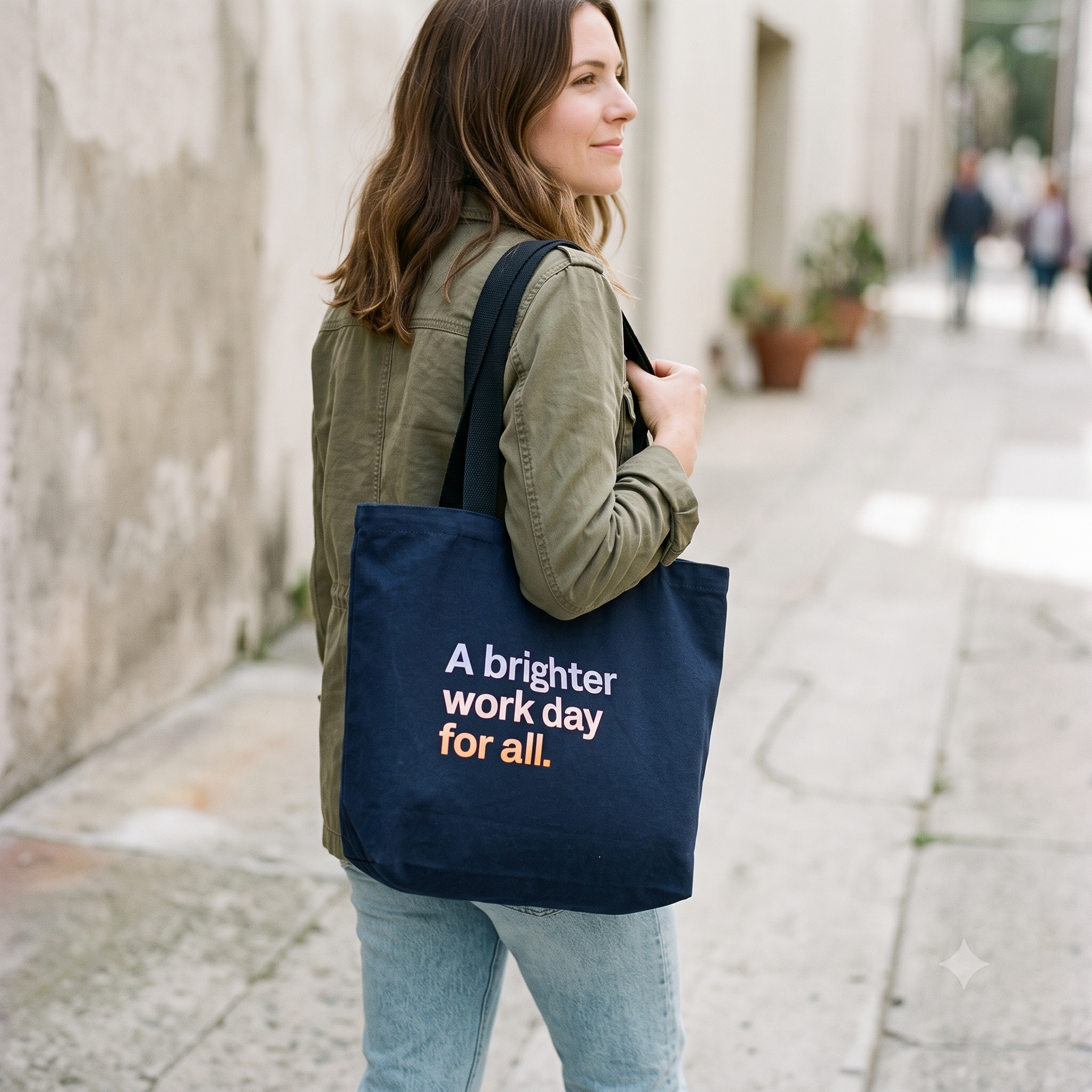
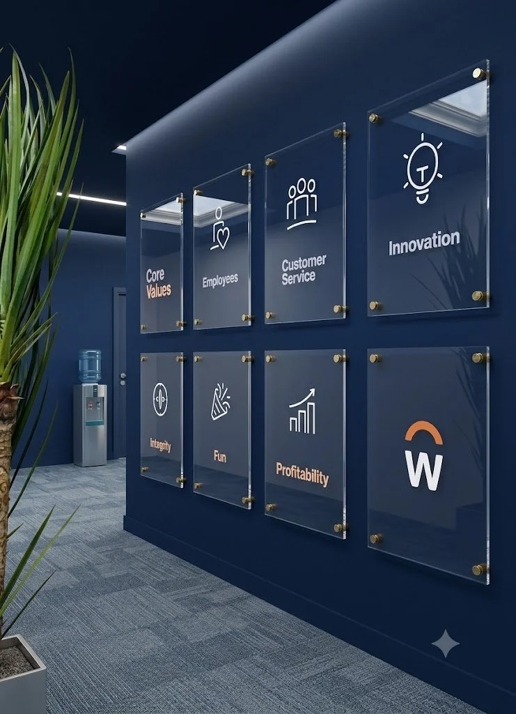
In 2025, Workday undertook a full global brand refresh alongside creative partners at Koto. The refreshed identity is rooted in optimism — elevating Workday's iconic sunrise with a redrawn logo, modern typography, and a suite of playful, office-inspired icons. The expanded design system reflects the shifts of daylight, from bright mornings to welcoming evenings.
OVERVIEW
ROLE
As part of the in-house creative brand team, I was a lead designer across multiple disciplines within the rebrand, owning two of its most system-critical workstreams end to end: iconography and photography.
PROCESS
Collaborated with four other designers to hand-draw 600+ unique icons, then individually led the refining process to make every icon work across multiple platforms and sizes.
Mastered a new stock-photography style and editing approach, and ran the process and approvals for 300+ new photo additions to the brand library.
Served as the brand advisor on photo retouching and helped curate the overall photography library.
Rebranded organizations on campus with fresh logos and assets, including the employee AI learning initiative, EverydayAI.
Led design and production of new merchandise for the company store — from t-shirts to bags to gradient socks — and designed the relaunch campaign for meeting-room screensavers and lobby displays.
IMPACT
The rebrand effort spanned many people and many more assets, but here's a quick look at some stats.
600+
icons hand-drawn
300+
photos added
18k+
brand ambassadors trained